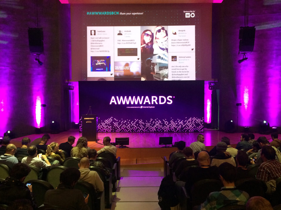
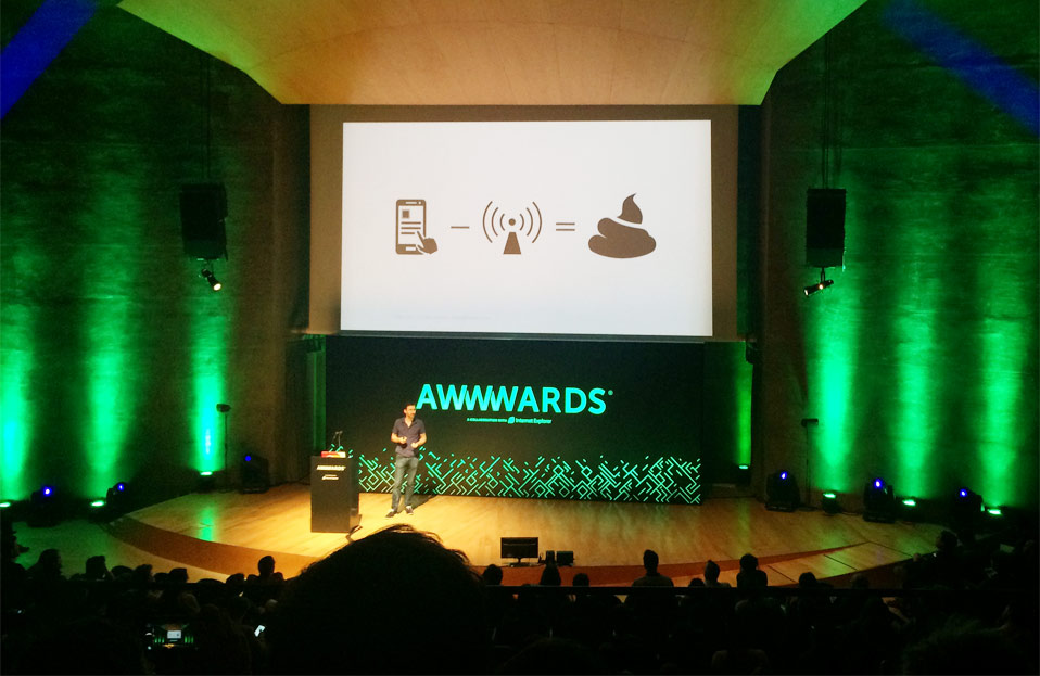
The Awwwards organizers found a pretty good balance between different topics during the two days. Every slot had 40 minutes which was long enough to dig deep into the topics. Apart from design and agency showcases there were also interesting speeches for developers and some future related talks. All presentations looked very professional and were packed with animated GIFs, Videos and humorous jokes.

We saw an awesome demonstration about Chrome developer tools which could become an important tool for designers soon. Paul Bakaus shared useful insights during his presentation. For instance, how the DevTools will be extended in the future. He demonstrated next-version-functions which include a slow motion of your website animations. Live editing of almost everything that happens on your page will become much easier - and it will update the codebase and files accordingly! Updated and intelligent colorpickers plus the feature to throttle various "Network" speeds such as 3G, Edge, DSL are really exciting and will help to develop better websites.
Bruce Lawson, part of the Opera Browser community gave an entertaining talk about the < picture > element and the need of truly responsive images. His slides, containing the "Browser Fairy Queen" can be downloaded here.
At day two Ricardo Cabello & Jaume Sanchez shared their insights about the WebGL technology and talked about the possibilities we have today. One of the best examples of their work is the spacewalk showcase for the well known Hollywood movie "Gravity".
One third of the talks were about design studios and their daily work experiences. Some of them showed impressive showcases.
Even though Haraldur Thorleifsson was not the most dynamic speaker, he shared some mind blowing examples of their studio Ueno. This two year old agency has already worked with Google, Dropbox, Medium, AirBnB and Reuters. That seems to be the way how the guys from Iceland are working. Choosing the very best and help them to improve.
The showcase from "Hvass And Hannibal" went in a slightly different direction. It was not about namedropping or just presenting their latest work - they explained how they work and how to deal with difficult situations. This two-woman-studio works with a lot of different materials and medias. We have found their style of working really interesting. Basically seeing how truly creative they get when they have to face lower budgets, has been an aspiring experience for us.

When Tobias van Schneider (most beautiful beard) entered the stage he showed some great examples of enjoying life and how to keep your mind fresh. He demonstrated how he created the "Authentic weather app" and other projects by accident. Also, he shared nice stories what he learned from organizing a festival in Austria. The full headline of his presentation was "Side projects are stupid, because they have to be". So everybody should start working on some experimental projects beside because most of them will teach you something. And some might be the next big thing.
I could continue with many other quotes which are worth to spread. From "Stop pitching" to "A website should look different in every device" and "Photoshop lies". You'll discover a lot more by checking out social media channels like Twitter, facebook or instagram and using the conference hashtag #AwwwardsBCN.
The AXA Auditori was very professional. Everything went smooth during the conference - they did a really good job. Next year it would be great to provide more possibilities for networking and interaction with the visitors. Choosing formats like Barcamps or others beside the Keynotes will make it easier to get in touch with attendees. Also the situation that 50% of the audience (which had a gold ticket) moved to the hotel next door to get coffee and snacks while the silver card owners had to look out for food and drinks didn't boost the interactions. Finally, a party were just 50% of your community is allowed to go might not be the best experience.

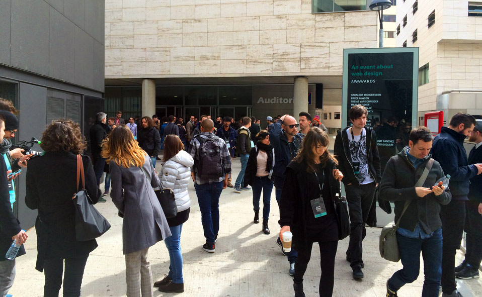
Bringing 600 creatives from all over Europe together and you'll find yourself among well dressed, long bearded, very fashionable people. This was a great demonstration about the common sense of beauty amongst our scene. It made every coffee break way more entertaining. There were many casual looks too, but the concentration of fashion-conscious people and bearded men was one of the highest we have seen at a tech conference so far. That was fun and nobody should feel offended - we also tried to look good!
We heard a lot of inspiring talks and got some great ideas for upcoming trends. Spending days in Barcelona is always a great decision - the city is super inspiring and was the right choice for this creative conference.
Did you know the only answer to the most important responsive web design question? http://dowebsitesneedtolookexactlythesameineverybrowser.com
Here you'll find the Awwwards Conference Website with an overview of speakers and topics.
See you next year!